WordCamp Nepal 2024
WordPress Event, January 5th & 6th
Redefining the way of WordCamp Experience.
Context:
The project revolved around designing the website for WordCamp Nepal 2024, an event centered on all things WordPress. WordCamps are community-driven conferences that bring together enthusiasts, professionals, and businesses within the WordPress community. These events foster knowledge sharing and help spread the enthusiasm for WordPress among a diverse audience.
The Objective:
Enhance accessibility and user engagement by combining local cultural elements with a modern design aesthetic, thereby connecting with both millennials and Gen Z users.
My Role
Designer
UI Design, Visual Design and Branding
Team
Bibek KC
Team Lead
Nerisha Shrestha
Susmita Poudel
Timeline
3 Months
1. Empathize
2. Conceptualize
3. Design
Empathize
2
3
Lacked understanding in user wants, needs and expectations.
Current Frustrations and Pain Points
Repetitive and Uninspired Design:
Users were frustrated with the monotonous and outdated designs of previous event websites. The lack of innovation and creativity led to a disengaging experience, especially for younger audiences like millennials and Gen Z.
Navigation Challenges:
Critical features like purchasing tickets or finding event information were not easily accessible. Users struggled to navigate the site, leading to frustration and, in some cases, abandonment.
What Did They Really Want?
Engaging and Modern Design:
Users wanted a visually appealing and contemporary design that felt fresh and different from what they had seen before. They desired a website that could capture their attention and excite them about the event.
Clear and Intuitive Navigation:
Users sought a straightforward and intuitive interface that allowed them to quickly find and interact with key features, such as event details, ticket purchases, and sponsor information.
1
Conceptualize
3
Overwhelmed with insights, needed to start prioritizing to form a strategy.
Current Frustrations and Pain Points
Repetitive and Uninspired Design:
Users were frustrated with the monotonous and outdated designs of previous event websites. The lack of innovation and creativity led to a disengaging experience, especially for younger audiences like millennials and Gen Z.
Navigation Challenges:
Critical features like purchasing tickets or finding event information were not easily accessible. Users struggled to navigate the site, leading to frustration and, in some cases, abandonment.
Jumped into secondary research to form our product strategy and experience.
  • Created system flow chart for clarity of our system
  • Prioritized attendees wants and needs
  • Created system flow chart for clarity of our system
Mind Map:
System Flow Chart:
1
2
Design
We were on a very tight deadline and developers needed to start building soon.
Should we design mobile first?
Designing mobile-first ensures that the most critical elements and content are optimized for smaller screens, creating a user-friendly experience that prioritizes accessibility and ease of use. This approach forces to focus on the essential elements and content, making the design simpler and more intuitive, which is crucial for users on the go who need quick access to information, such as event details or ticket purchases.

Additionally, starting with a mobile design allows for a natural progression to larger screens, ensuring the website is responsive and maintains a consistent user experience across all devices. By addressing mobile users' needs first, we ensure that the site is functional and engaging for the widest possible audience, aligning with the goal of making the website accessible and user-friendly for all kinds of users, regardless of their device.
Did we need a design system right now?
A design system ensures consistency across all elements of the website, such as buttons, typography, color schemes, and layouts, creating a cohesive user experience that enhances navigation and usability. Given that the project involves collaboration among multiple designers, a design system streamlines communication, reduces redundancy, and ensures a unified approach. This is crucial for maintaining a consistent visual language and avoiding design discrepancies. Additionally, a design system allows for scalability, making it easier to update and reuse components for future events, thereby saving time and resources. It also facilitates faster iterations, as designers can quickly make changes and test different elements without starting from scratch. Furthermore, incorporating accessibility standards into the design system ensures the website is inclusive, aligning with the goal of making it accessible to all users, regardless of their background or technical skills. Finally, a well-documented design system improves the developer handoff process by providing clear guidelines and reducing misunderstandings, ensuring the final implementation aligns closely with the intended design. Therefore, even with a tight timeline, investing in a design system will significantly enhance the overall design and development process, ensuring a high-quality, scalable, and accessible website.
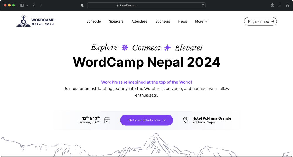
Once we answered the burning questions, we commenced design right away.
  • Built a Design System as priority.
  • Moved forward with Mobile first design.
Here are some key tests conducted to evaluate and refine the design of the WordCamp Nepal website:
  • Attention heat map testing
  • Focus map testing
  • Contrast map testing
Attention Heat Map:
Focus Map Testing:
Contrast Map Testing:
Overall Design Highlights
Modern Aesthetics with a Local Touch:
The design for the WordCamp Nepal website blends contemporary design elements with local cultural themes. This fusion creates a unique aesthetic that resonates with a diverse audience, from tech-savvy millennials and Gen Z to professionals and business sponsors, reflecting the vibrant community spirit of WordCamp events.
Responsive and Mobile-First Design:
Emphasizing a mobile-first approach, the design ensures that the website provides an excellent experience across all devices. The responsive design adapts to different screen sizes, maintaining functionality and aesthetics whether accessed on a smartphone, tablet, or desktop.
Scalable Design System:
A comprehensive design system was developed to maintain consistency across the site and streamline future updates. This system includes standardized components, typography, color palettes, and spacing guidelines, ensuring a cohesive look and feel while allowing for scalability for future WordCamp events.
Thanks for stopping by! Have a nice day:)