We keep hearing “Good design is simple.”
But here’s the uncomfortable question: When does “simple” become an excuse for not thinking it through?
Simplicity in design is not about removing things until you can’t remove more. It’s about keeping the right things and removing the wrong ones.
But sometimes, we see designs stripped so bare they feel soulless, detached, and … lazy.
Not minimalism, just minimal effort.
The “we’ll fix it in V2” mentality disguised as clean UI.
Whereas true simplicity is intentional:
Lazy design hides behind the phrase “Less is more” when it really means “I didn’t bother.”
Let's walk through any old part of a city:
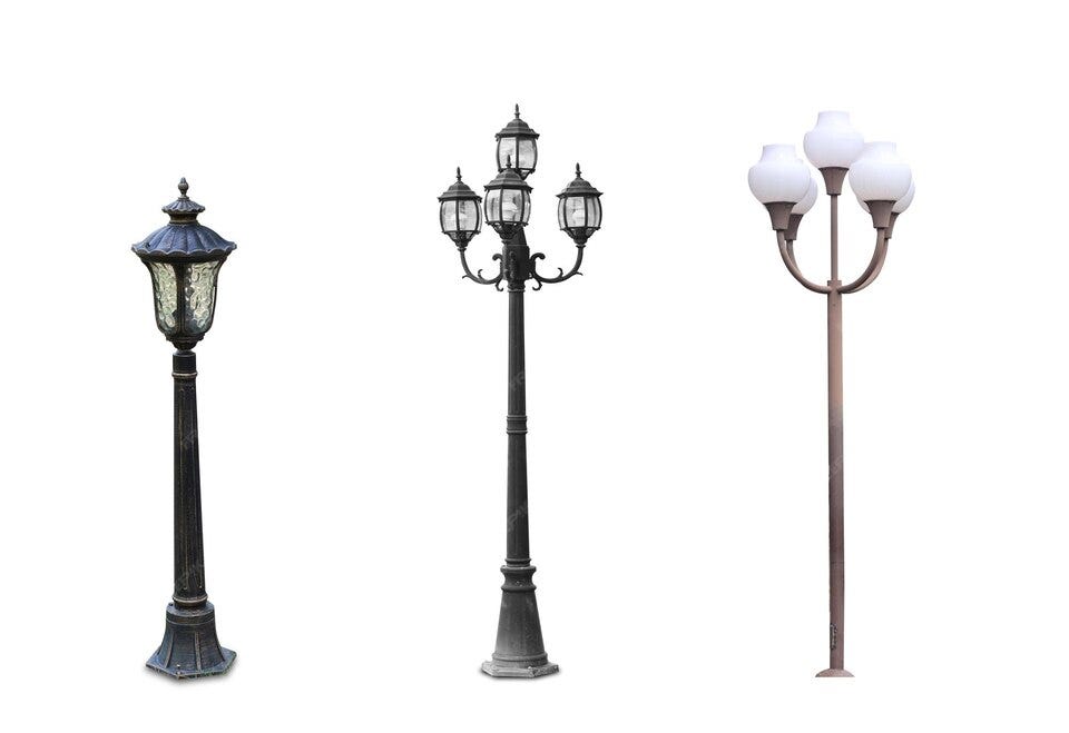
A century-old bridge, a cast-iron streetlight, an old postbox.
You’ll notice something: they have a soul.

They weren’t just “functional.”
They were crafted. Someone obsessed over the curve of the lamp post, the carving on the bridges, and the font on the metal plate.
Even purely utilitarian objects carried a signature.
Now compare that to today’s design.
Streetlights? Steel poles with LED heads.
Buildings? Glass boxes.
Logo? Sans-serif wordmarks in black.

We call it simplicity.
But sometimes, it’s just… bland.
Cost-cutting. Mass Production. Decisions made in spreadsheets, not on sketchbooks.
The simplicity still exists, but it’s rare.
Vintage designs solved functional needs and left room for beauty.
Today, in the rush to be “Minimal”, we sometimes forget the “Human” part.
So that’s maybe the reason vintage still charms us, it wasn’t afraid to take up visual space, to wear a personality, to leave a fingerprint.
The Eagle Eye Test for you:
If you want to spot lazy design disguised as minimalism, you need to train your Designer Instinct. Try this:
Once you see it, you can’t unsee it.
Question for you:
Are we moving towards pure efficiency at the cost of soul, or is the soul just evolving in ways we don’t recognize yet?